Don’t Let the Mobilegeddon Zombies Eat Your Website’s Rankings

Mobilegeddon will not eat your brains .. but it may eat your ranking. Picture ©2013 Dime Store Zombies. Used by permission.
NOTE: This is not meant to be a technical article, but is written in layman's terms to help small business owners understand the effect Google's most recent change may have on their website.
I know to some, Mobilegeddon sounds like it should be a character in the new Avengers movie (a friend of Ultron?) or a episode of the Walking Dead. However, it really is not that scary, unless you have not updated your website for some time. If your website is NOT mobile friendly, then a penalty from Google may eat your ranking position in the search engines. This change did not come as a surprise; Google has been warning all of us for some time that this was coming. However, just like the Year 2000 problem (which we all had plenty of warning about), some businesses were still not ready when it hit. Either they didn't take the penalty serious or did not realize it would affect their company website.
So, What is Mobilegeddon Anyway?
Mobilegeddon is a name that was given to the changes that Google made in it’s algorithm (formula) it uses to rank websites in search engine results pages (SERPs). This change happened officially on April 21st, 2015. If a website is deemed to not be ‘mobile friendly’ that website would be pushed down in the organic search page result when the search occurs on a smartphone. This means that if someone was search for a business that included key words you want your website to be found for, your listing would be several positions (or pages) deeper in the search page results list that comes up if the search occurred on a smartphone. One of the reasons this is so significant is that over half of all Google searches occur on smart phones.
Below is an example of how you would like Google to display your results when a search is made on a smart phone –
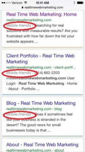
Google marks websites that are "Mobile Friendly"
What does “Mobile Friendly” mean?
Mobile Friendly simply means that a website is built in such a way that it will resize itself (or adjust) automatically when being viewed on a smartphone. Websites used to only have to be built in such a way that they looked presentable and functioned well on a desktop computer. Now that over 60% of all website views take place on smartphones and tablets, website designers have to build multiple versions of a website so that those who view it on a smartphone will still get the best experience possible. For example, the navigation should adjust depending on screen size and orientation of the device (held upright or sideways). All text should be readable and images, video and media should resize automatically depending on the device being used.
What can I do if My Site was Affected?
There are several things you may be able to do if your site is affected by this change. Google has provided a couple of useful resources to check your website and see what they are looking for when they check your website.
- If you want to see if your website is mobile friendly, you can click HERE to use Google’s tool to check it.
Or you can call me for a mobile friendly check-up at (714) 662-2203. Some sites can be fixed with some minor adjustments, other websites may need a complete overhaul or to be redone completely. I would be happy to work with you and help you make these changes.
Remember, the web moves in real time, don’t get left behind!